

| 30. Jan. 2000. Tomi Engel | |||||||||||
|
|
|
||||||||||
 |
|||||||||||
Take a look at the "look" of the currently existing user interfaces and the planned future. No written description can really describe the "feel" and "ease of use" of the single interfaces but it might underline some basic concepts.We have listed the most important innovations which have been implemented in a each of the different UIs. Follow the links to get some more detailed descriptions.
Rhapsody's user interface will combine elements from both the Mac OS and NEXTSTEP, but will be closer in look and feel to the Mac OS Finder. We realize that customers need a consistent interface in the two operating systems to deploy them throughout a single organization. It's important for training and ease of use. One of the advantages of NeXT's technology is the easy support of multiple user interface paradigms.
This was the official description of the new UI back in the days of Rhapsody. With the unified Mac OS X strategy things have changed a little bit. Some features will be radically different but they will be either easy to understand or they will get introduced step by step. The Finder is an example for these "creeping changes". Since the Mac OS X Finder is a Carbon application it can be shipped with a future version of the traditional Mac OS (9.5 ?), giving the users time to learn its new features even before moving to OS X.
However, before we get into all the details, we need to give a brief overview of the different UI concepts and issues so that it will be easier to understand how they affected Aqua ... "Aqua, an interface so liquid you want to lick it".
 |
 |
 |
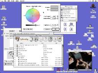
| Mac OS (Classic)
The first commercial GUI; Desktop to drop icons and aliases; Global Menubar on the top; Windows, floating windows and modal panels; Application centered. |
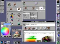
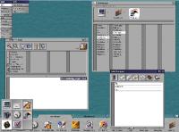
OPENSTEP
Designed for multitasking; Dock to hold apps; Running apps and minimized windows visible as tiles; Floating vertical menus; Big toolsbar icons; Services; Key vs. main windows and panel. |
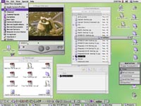
Mac OS X Server
Mix of Mac OS 8 and OPENSTEP beta UI; Desktop for aliases; Smaller toolbar icons; Shared process menu to switch between "blue" and "yellow" apps. |
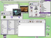
| Mac OS 8 (Platinum)
Coplands Platinum theme with partly customizable appearance; Finder windows parked at the bottom; 3D look; Context menues; Detacheable process menu. |
OPENSTEP (Beta Design Study)
Tabbed shelf holds apps, colors, documents; Smaller toolbar icons; Drag&Drop of document windows; Modified Window title bar. |
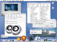
Mac OS X (Aqua)
Translucent items with shadows and a liquid touch; Sheets (panels attached to windows); Dynamic dock for everything; Large, scaleable icons; Lots of live feedback. |
The Challenge
With Mac OS X Apple has the chance, and the long overdue need, to innovate radically in order to once again offer a real advantage over Windows. This usually means change and change always comes at a price.
Many Mac users might not see the urgent need for changes at the UI level but when you look closely you will discover that this landmark of UI design is showing its age and is not as smooth and simple as one might believe. Since Apple has to innovate to attract new customers it has to search for new concepts in user interface design while at the same time balancing with the needs of the installed and trained user base.
As you will see shortly the matter of designing a good user interface is quite complicated. Some existing Apple UI does not scale to a real multitasking operating system (like "really modal" panels) while adding some features from NeXTs UI will require additional changes to prevent "followup" problems. If, for example, you switch to proportional scrollers with live scrolling, or live window resizing, you should adjust some other behavior too (how to deal with slow redraws etc.) to maintain a user experience which lasts beyond a demo.
Real multitasking makes an advanced user a lot more productive but the UI needs to address the new features and should not be in his way. Novice users, on the other hand, usually do not understand multitasking and can get very confused if the UI does not "protect" them to some degree from getting where they didn't wanted to go (which bascially is the idea behind Wizzard panels).
So the requirements diverge and the expectations are high.
Flow, Aqua flow
Being a first class citizen of Mac OS X will require modification of applications (due to the simple but necessary step of carbonizing the source code) and this sure is the right moment to make them support an advanced UI (by adjusting the icons or file structure layout etc.).
Apple and NeXT both have UI experts and we should be faithful that they will grab this unique chance and do the right thing. You might look at Taligents CommonPoint to see how Apple wanted the future to look like some time ago. To some degree CommonPoint looked like another possible merger of both UIs. The concept of "People, Things and Places" was not a bad idea too.
Aqua will not only be about making an operating system look good (with all the transparency, drop shadows and colorful icons) but it should be about a making the OS even easier to use and prepare it for a more document based style of work.
Before going into details we would like to give you a feeling for the complexity of user interfaces design ...
